Applying the Gestalt Principles to your code
April 25, 2019
It’s one of the most repeated phrases in software, but is also quite easy to forget - you spend more time reading code than you do writing it. According to the idiom, it’s about 90% of your time reading it, and 10% writing it.
This is the basis of clean code and the movements around it. One set of principles that I read online many years ago - and have since been unable to find the article - tied the Gestalt Principles into writing code, so I’ve tried to recreate it here with my own examples.
Keeping source code easy to read
Back in 2013 I wrote about measuring the code quality in Roadkill using various metrics. This included cyclomatic-complexity, object-oriented metrics (coupling, lack of cohesive methods, number of children) which were being measured by NDepend, but are also available to view via tools like Sonarqube.
These are your quality gates, which you can use to ensure code is not complicating over-time, closing the gate if it is and restricting new releases going out.
Below these formal code metrics that sit inside the continuous integration/delivery systems are tools like Stylecop, and Roslyn based formatters such as dotnet format and Editorconfig which will clean your code as you go or inside the IDE.
Then one layer below the tooling is the philosophy of clean code itself, championed by Bob Martin (watch his videos they’re amazing) and software craftsmanship.
But what about the visual appearance of the code itself?
Gestalt principles
The Gestalt principles concern themselves with how we visually perceive groups of objects. There is a good introduction to Gestalt pyschology and Gestalt principles on verywellmind. Wikipedia also summarises it fairly well:
…(the) principles exist because the mind has an innate disposition to perceive patterns in the stimulus based on certain rules. These principles are organized into five categories: Proximity, Similarity, Continuity, Closure, and Connectedness.
I’ll go through the principles with my our badly drawn sketches, to show how I think they apply to source code (using Roadkill v3 for examples). We skip the additional Common Region/Fate law as it related to movement of objects.
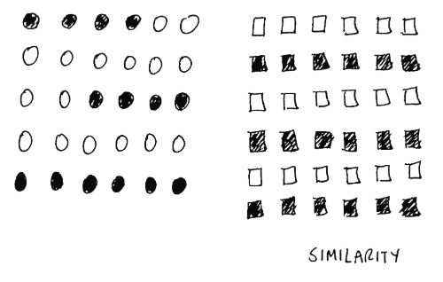
1. Similarity
Similar things tend to appear grouped together.
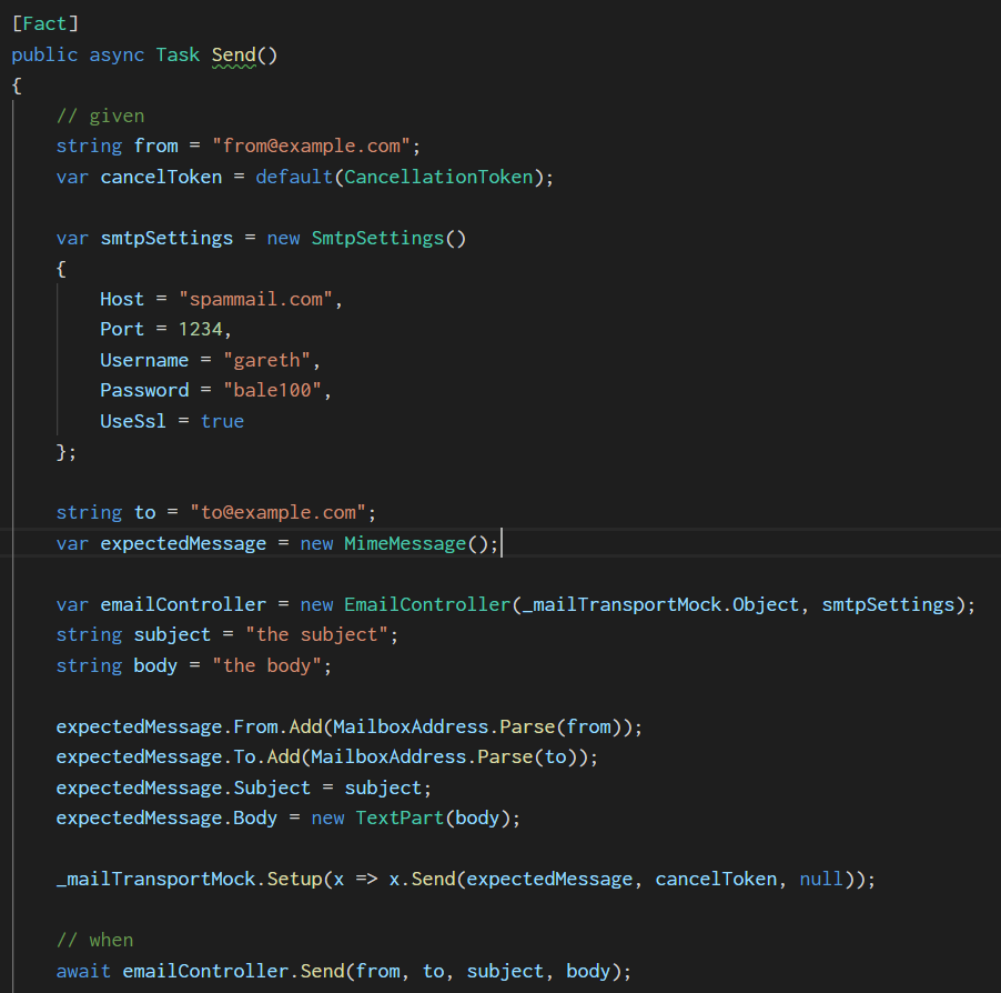
The two examples below demonstrate this, taken from a unit test. This first image shows the variables without any grouping:
The second version of the unit test below has the variables grouped according to type. The types and the length of the characters each has (e.g. ‘string’) helps to naturally group them together making it instantly easier to read.
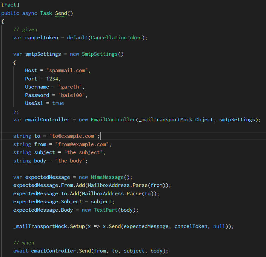
The unit test could arguably be improved further by adding the cancelToken closer to the .Setup method that it’s used with, as they naturally group together
as the cancelToken is a parameter of the method.
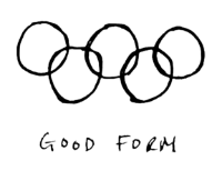
2. Good form/Pragnaz
Example: you see the olympic symbol as a single object rather than a set of curves.
This Law is a bit more vague than the others. The basic gist is that if you have a well formed object you won’t notice the parts it’s made up of.
The example below shows three versions of the same LINQ statement. The first demonstrates the statement as a single liner, which shows all methods grouped as a single line. This is harder to read.

The next version has used vertical tabulation to create an easier to read block of code. You don’t notice the white space and tabs.

And then this final version puts the method that is being setup on a new line. Is this last version better or worst? I’d argue worst because you want the class and method you’re testing to be closer to each other, and not on separate lines. However, it also has an improved “good form” over the previous version.

3. Proximity
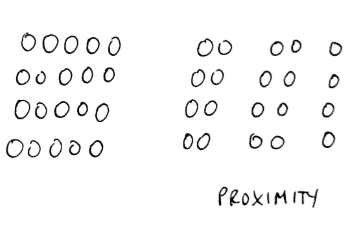
Things that are nearer each other, appear to be grouped together to the eye.
This law is close to the similarity law, but focuses on the space between objects rather than similarity of the objects.
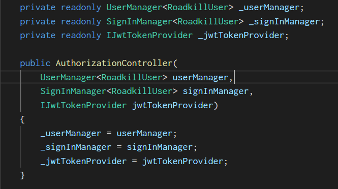
The example below shows three versions of the same class, that has 3 fields and a constructor. This first version demonstrates how newlines (in the fields) feel like they aren’t related, when they are as they’re fields - and readonly ones.

This next version has aligned the fields together, and is a lot easier to read, as the keywords are in proximity to each other so the eye naturally groups them and knows they are all fields, readonly, and private. This crosses over into the similarity law.

We can do one better though, we can vertically align the parameters of the constructor, so they are in closer proximity to each other. The version before had them as a single line - so we naturally read all three parameters as a whole and end up having to spend more time visually picking each parameter out individually.
Vertically aligning them makes it easier to see these are the parameters, and it’s the constructor.
4. Closure
Things are grouped together if they appear to form a whole (your eyes fill in the gaps).
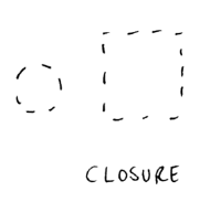
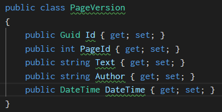
The example I have for this law shows the Closure law in reverse - if we have newlines and therefore too much whitespace, then we don’t see the class as a whole but as a series of individual lines (the properties).
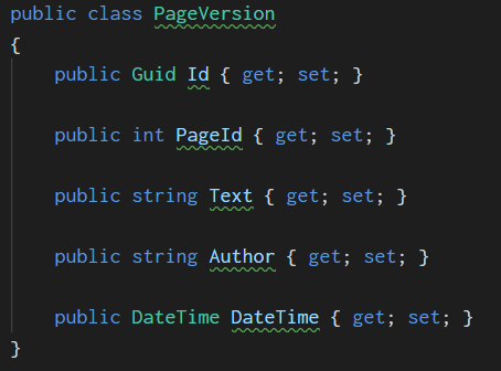
Many people prefer the version above, and life is too short to argue for a long time about it. It’s a little bit of a stretch to tie it into this law, but in the version above our eye doesn’t close the newlines to form a whole, so removing these newlines helps us to see a single class at first glance, then allowing us to read the properties if needed.
5. Continuation
An intersection of two objects, such as a coat of arms, appears to the eye as one single object.

Which of the code examples below do you prefer? According to the similarity and proximity laws, we should be using the second version. And once
again if we use the Continuation law with the first example, we do see a single object from the intersection of [] around each attribute.
The second version doesn’t suffer from this problem, and we have good form achieved at the same time, where the [] characters get ignored by the eye,
rather than impede our reading of the code as in first version.


I'm Chris Small, a software engineer working in London. This is my tech blog. Find out more about me via Github, Stackoverflow, Resume